Designs
Designs are where you put together everything else you've done in Component.Studio, to finally make your game components.

Designer Toolbar
 From left to right here's what everything does:
- Back - takes you back to your game.
- Fullscreen - Puts the designer into fullscreen mode to give you the most possible real estate.
- Component List - Allows you to move back and forth through your dataset to find the specific component you want to work on visually.
- Side Selector - Choose which side of the component you are working on.
- System Status - When it's just a green dot, then the system is ready. Any other icon you can mouse over it and see what the system is doing. If you click on it, it will trigger a recalculation of all calculated values.
- Zoom - Choose how big the renderer should be.
- Overlays - Choose whether to display the overlay template and various colorblind filters.
- Debug - Debugging menu, only for developers.
- Inputs - A menu of all the other things in the system you have created (images, styles, dataset, variables, etc).
- Export - How you can export this design into images, PDFs, Tabletop Simulator, or The Game Crafter
- Help - Takes you to this help system.
Renderer
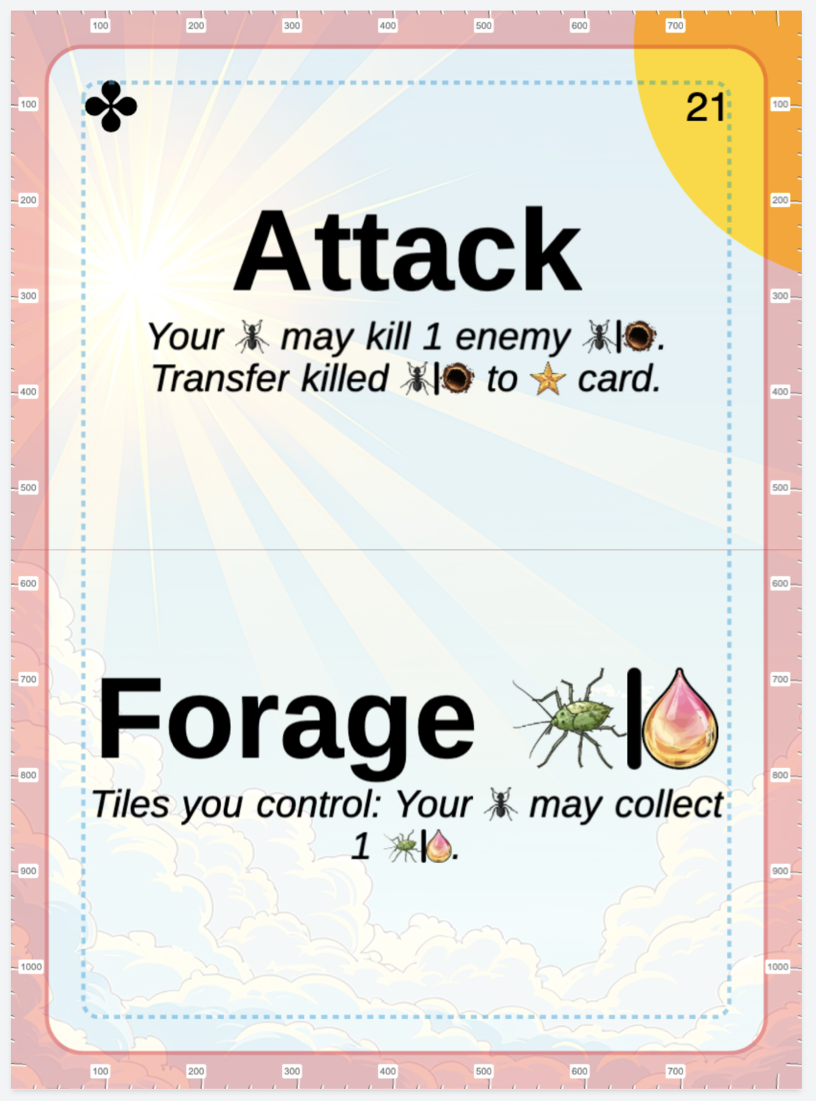
The renderer shows you what this design currently looks like. You can click on any visible item in the design to open its layer in the layers panel.
 Layers Panel
The layers panel shows you all the layers in this design for this side. You can click on any layer in the layers panel to open up all the various options that layer has.


 Layers Panel